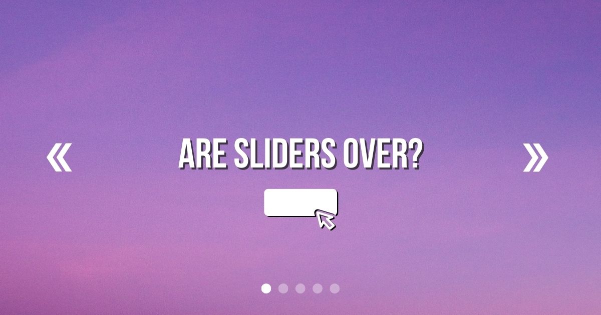
Are website sliders useful or pointless? Let’s discuss.
One of my most commonly requested features on new websites is a full-page slider or background video on the homepage.
This may seem like an attractive feature to greet your visitors on your home page, but sliders are almost always a bad idea when used in this context.
Here’s why.
1. No one will go past the first slide
When people land on a website, it’s because they’re looking for information. Being greeted with some sliding image or a video that plays without asking isn’t going to make the visitor stay and watch. It’s highly likely they’re going to scroll down within 2-5 seconds, making your 2nd, 3rd and 4th slides unless.
The only time when a slider, image carousel or video isn’t useless is when the visitor is already engaged enough to scroll through an entire gallery.
For example, of a property listing page, a hotel room or ecommerce product. Sliders do have their place, but they don’t belong on every page.
2. Sliders slow your site down
Website sliders usually feature large, full-size images. One large full-size image is OK, but sliders will contain several of these off-screen. That means that the browser must load additional content that the visitor probably won’t ever look at.
Sure, lazy-loading exists, but those images still exist in the document and still generate additional requests from the server. It’s just unnecessary to make your visitors wait several seconds for your elaborate above-the-fold slider to load when they’re going to scroll straight past it anyway.
The speed in which your website loads has an impact on your SEO and search engine performance. Google wants to provide the best user experience for its searchers, and we’re all aware that slow websites are frustrating as hell.
Ditching your slider could significantly speed up your website; if you’re reducing 4 or 5 images down to 1 single hero banner, your site could be up to 80% faster!
3. Slider controls are often fiddly and not accessible
A basic website slider usually has some way to control it. You’ll probably see these methods used in the wild:
- Navigational arrows
- Navigational dots
- Play and pause buttons
But just how easy and intuitive are these controls, really? Those small dots at the bottom of sliders are often so close together, making erroneous clicks extremely easy to do.
Some sliders can be swiped on a touch screen, some can’t. There’s no consistency in how a user operates a website slider, and their fiddly controls can cause additional issues for users of assistive technology.
Many sliders also rely on motion and animations when switching slides, but they don’t make use of the prefers reduced motion CSS media query to reduce the intensity of the motion.
Pair this with the fact that no one will read past your first slide anyway, and consider whether its worth investing time on slider accessibility, or finding an alternative design element to replace it.
4. Sliders cause Cumulative Layout Shift (CLS)
A poorly designed slider can end up causing SEO issues for a website.
Sliders either multiple images and content of differing lengths can cause the layout of your website to shift up and down when the slides change.
This is frustrating for the user, especially when slides automatically change without warning. Anything that gives a negative user experience is also bad for SEO.
Shifting website layouts has a name – Cumulative Layout Shift. Did you know that your website has an overall score for how much the layout shifts? The ideal score is 0 as your website’s layout should not shift at all, ever.
Your CLS score is then added to your overall Core Web Vitals Score. Sites with poor Core Web Vitals may rank lower in search results.
5. Sliders require pixel-perfect design consistency
Even though I don’t like them, as a professional web designer I can knock out a slick-looking slider that looks, behaves and functions as it should.
Yet, that still requires a fair amount of work to get it right. All the images need to be edited I’m Photoshop (or similar) to the same size and aspect ratio. They also need to look good on mobile and tablet screens. Any headings, text and buttons need to be clear, well-contrasted and visible against all the different image backgrounds.
Usually, spacing will need to be adjusted for mobile screens. The slider’s behaviour needs to be adjusted with JavaScript and its appearance requires a lot of CSS media queries.
Then, if the client wants to change the photos in the future, they may find themselves rather limited in what photos they can use.
There are also non-designers who stumble across WordPress Plugins and create wild drag-and-drop Sliders that turn out to be a nightmare for shifting layouts, excessive DOM size and huge dependencies on external libraries and stylesheets.
Sliders can be good or bad, depending on who designs them, but that doesn’t make them any more or less purposeful.
6. Sliders can lower your conversion rate
Is your website there to look pretty or make you money? Sliders can be distracting for the visitor, making them less likely to click on your calls to action.
Tip: if you have a multi-slide slider, create an event in Google Analytics to measure how many people view the 2nd, 3rd or 4th slides. If no one sees them, it’s time to ditch them!
7. Sliders peaked in 2009
In 2009, sliders were cool. By 2015, we were tired of seeing them. In 2022, it’s like wearing skinny jeans to a party full of Gen-Z party goers. Not. Cool.
If you want your site to look modern, find another design element to compliment your call to action instead.
Conclusion: You don’t need a slider
Sliders are frustrating, annoying and don’t act to help the visitor in anyway. I’m not just here to throw shade at website sliders, here are some alternative design elements you can user in place of a slider on your home page 👇🏼
Slider Alternatives
- Plain text on a contrasting background
- One sentence and a call to action
- A simple animated vector graphic
- A subtle entrance animation for your hero text
Times when sliders are suitable
- On product pages or property listings when the visitor is already engaged enough to Swipe through a carousel of images
- When used to display testimonials
- For content carousels – aka Netflix style navigation (this isn’t technically a slider, but still)