Is your WordPress website accessible to those using assistive technology, people with visual impairment, cognitive impairment or other disabilities? If you’ve made your own website by downloading a free or premium theme, then it may not be accessible out of the box.

Even if your theme does come with accessibility features, what about your content? There’s certainly a lot to think about!
As a freelance website designer and consultant living in Wales, I had a request recently from a local organisation to make their website “Welsh Government Accessible“. Naturally, I had to ask a few more questions to find out what they actually wanted and let’s just say it has absolutely nothing to do with Welsh Government whatsoever!
This request referred to the Web Content Accessibility Guidelines (WCAG 2.1) – an overarching set of principles and practical guidelines to make websites and apps accessible to users with various disabilities.
In this article, I will explain these principles and give you practical tips to make your WordPress website more accessible in accordance with the guidelines.
What are the Web Content Accessibility Guidelines (WCAG)?
They are a set of recommendations to help designers, developers and creators make the internet more accessible to people with various disabilities.
The principles of these guidelines stay the same, but the techniques used may change and evolve over time.
In 2018, the guidelines were updated for the first time in over 10 years to version 2.1. The recommended update covers:
- people with cognitive or learning disabilities
- People with low vision
- Disabled people using mobile devices
The Principles of Web Content Accessibility
The four principles of the Web Content Accessibility Guidelines are that content and web applications should be:
Perceivable – information should be presented in such a way that it can be perceived by everyone.
Operable – all the on-page components should be usable.
Understandable – information and operation should be understandable.
Robust – technology should be robust enough so that content can be interpreted by different user agents, including assistive technology. Reliability is also important.
Levels of conformity
These are A, AA, AAA, with AAA being the highest level of conformity.
This does not necessarily mean that having AAA buttons on your website itself automatically meets this standard, although, I expect quite a few developers were rubbing their hands together with glee in the extra fees they could charge people for implementing this feature without fully scoping the need.
Correctly marked up and designed websites do not need an AAA button to achieve conformity. But, it may help with applying accessibility features to a very old site without the need to totally rebuild it.
Consider a website inherently accessible or not, it shouldn’t need a special button to make it so.
Check your website’s accessibility
Before you start changing things, you need to check your website’s current accessibility – there’s no score out of 100 like there is with Page Speed Insights! There are plenty of credible free tools you can use to check your website against the WCAG’s principles:
- tota11y by Kahn Acadmey
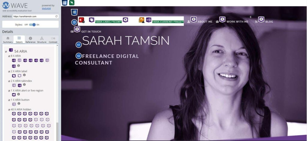
- WAVE – Web Accessibility Evaluation Tool
- Web Accessibility Evaluation Tools List
You should now have a better idea of how much work you need to do in order to make your website fully accessible (very few websites are, even ones you’d expect would be!)
How to apply accessibility principles and guidelines to your WordPress site
This article would be 20,000 words long if I listed everything you needed to do to achieve AAA conformity.
However, some changes to make to your WordPress site to help make it more accessible:
Hidden skip navigation link
Also called a “skip to content” link.
This is a hidden link, accessible to screen readers and keyboard navigation that allows the user to skip past your website’s menu to get straight to the main content.
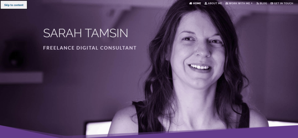
Without this important hidden link, someone would have to repeatedly skip through all the items on your website’s menu before they could access the main content.
Or, in the case of screen readers, it would have to read out the entire menu on every single page.
Teat to see whether your WordPress theme has this feature. If it does not, ask it into the header.php file of your child theme.
Alternative text for non-text content
Commonly known as “alt tags” (alt is actually an attribute, not a tag, <img> is the tag, alt is an attribute of <img>).
All images, videos, gifs, and other non-text content should have an appropriate text description.
In the case of infographics, this should replicate the text of the graphic. For photographs, it should be descriptive (not stuffed full of keywords for the sake of SEO!)
The only time when alt text is not required is when the image is purely decorative.
Like this purple swirl, for example:

It has no real purpose other than to look pretty, so it does not need alt text added to it. Learn more about ALT Text on RNIB’s Website.
Descriptive link anchor text
Don’t use “click here” instead of writing proper anchor text. Definitely never use the URL as your anchor text. Please.
I say please, pretty please, because so many websites have this lazily written call-to-action all over them.
“Click here to read more” is terrible anchor text.
If a screen reader is navigating using links on the page, how will the user know where to navigate if every link is “click here”?
This poor practice stops now! Stop writing “click here” and start writing proper descriptive anchor text instead, it’s also better for SEO and user experience.
Related Post: Don’t make these common WordPress mistakes!
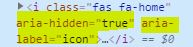
Use ARIA semantics in your mark up
This is crucial.
ARIA stands for Accessible Rich Internet Applications.
You should use ARIA attributes, for example aria-hidden=”true” where it’s appropriate to do so, such as for FontAwesome or other icon fonts that are widely used.
Learn more about ARIA attributes in HTML. (See, that’s descriptive anchor text. “To learn more about ARIA attributes, click here” would be wrong.)
In WordPress, good themes will already have ARIA attributes included in its main navigation etc. However, it wont automatically apply them to content you’ve added yourself.
If your theme doesn’t include ARIA markup, then add your own to your child theme files where it’s needed. My theme does not include sufficient ARIA markup, so I had to write a script to insert ARIA markup at scale. Let’s hope your theme does this for you!
Choose your colours and fonts carefully
Colours & font choices play a large role in your website’s accessibility.
White text on pale pink or yellow? Nope.
Blue text on a green background? No way!
There should be a high enough contrast ratio between the colour of your text and the background. There are no hard and fast rules, which is why it’s so important to test contrast using a dedicated tool, not someone’s opinion – use evidence during your testing, not hearsay from your boss’s boss – do what’s right. You cannot rely on testing “by eye” due to varying quality of computer and phone screens.
When choosing fonts, opt for a sans serif web font such as Open Sans. You can get away with display fonts for headings, but you should use script or handwriting fonts with caution, also specifying a web-safe fallback font.

A note about Dark Mode
Whilst this doesn’t directly relate to the Web Content Accessibility Guidelines, I felt it was important to mention dark mode as a strong emerging trend.
Dark mode is an accessibility feature that aims to reduce eye-strain. However, it’s currently being rolled out as a simple toggle on/off feature in lots of popular apps such as Twitter and Pinterest.
I am a fan of dark mode because it is genuinely easier to read light text on a dark background than vice versa!
Chrome will soon have a built-in dark mode toggle that can be applied to any website! In fact, there’s a deluge of third party tools that already do this.
The question is, is your website ready for dark mode? How does your site look and feel if the user flicks the toggle over to the ‘dark side’?
Use correct heading mark up
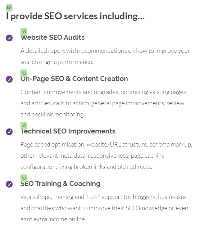
Oh headings, I see so many websites doing them all wrong. This is a very common mistake which is negative for accessibility, usability and SEO.
Headings are structural and used for on-page navigation, they’re not just decorative.
Don’t use bold text in place of a heading either.
Your main page heading is Heading 1. Your next sub heading is heading 2, and all future subheadings on that page are heading 2, unless heading 2 requires a sub-level below it. In which case, that would be heading 3.
Get it?
Headings are important for the way accessibility software navigates through a single page on a website. They’re also important for SEO, so go and audit your website’s headings!
If you don’t like the default style of your there’s headings, write your own CSS or define different classes of headings for different purposes, such as <h2 class=”blog-heading”> or <h3 class=”footer-menu”> then add your styles for these two new classes in your theme customiser.
Ensure your site can be navigated using only a keyboard
Not all people use a mouse or touch screen to browse the web. A keyboard is the primary way to operate a computer, so you should be able to navigate your website with no mouse at all.
Try it out yourself…
Visit your website, ensure the browser is the active window and hit the ‘tab’ key on your keyboard. It should switch through your menu items, sections and links on the page.
If it doesn’t, you would need to add this functionality into your theme, hire a developer to do it for you, or find a new theme with better accessibility!
Ensure your website adheres to general standards
As in, don’t make people scroll diagonally or sideways! Your website should behave predictably in a way that you should expect a website to behave.
E.g. clicking a link to open another page, pressing play on a video should play a video, pressing submit on a form should submit the form…
This seems like common sense. But businesses sometimes try to be ‘too clever’ with their website design. The result… it’s just difficult to use.
Use tables to display data, but nothing else
Tables should not be used for lists, layouts or any other design function other than displaying data that is meant to be displayed in a table.
Using tables for purposes other that tabular data is not accessible.
When you do use tables, make sure you have correctly labelled and marked up column headers etc. (Are you spotting a theme here? Clean and correct code = a more accessible website!)
Use Semantic HTML Tags
Semantics help assistive technology better understand the purpose and content of a page.
HTML5 has the ability to add semantic tags to your markup, so if your article contains a quote, wrap it in <quote></quote> tags, or <aside></aside> is another example.
Semantic tags are not there for style purposes, they’re there to define meaning to sections of your content. This is why use of tags like <b> (bold) and <i> (italics) were replaced in HTML5 with semantic equivalents; <strong> for bold and <em> for italics (emphasis). Italics has no meaning, but emphasised text does have meaning within context.
A good WordPress theme will include semantic tags in the theme’s templates, but it’s your responsibility to do this for your content.
Create your content with accessibility in mind
Accessibility should not be added as an after thought, you should design and plan your content to make it accessible. The Web Content Accessibility Guidelines are there for publishers to follow; publishers in this sense means:
- Content writers
- Web developers
- Web designers
These guidelines are there to help you, not hinder you.
Accessibility on my own website(s)
All of these accessibility best practices I’ve implemented on my WordPress site did not come with my theme. I had to take steps to ensure that my site had:
- correctly marked up navigation
- headings done properly
- alt text
- ARIA markup
- all important areas of content are high contrast
- descriptive link and anchor text
This site uses Divi as a theme and a framework, and it’s well-known that this theme is not extremely well-suited to accessibility.
Fortunately, CampusPress has developed a plugin specifically for Divi to add in missing accessibility features. As of May 2020 it’s no longer available in the WordPress repository, but it’s actively maintained over on GitHub. Get the free Divi Accessibility plugin here.
There’s always more work to be done…
Even if your website has implemented most accessibility best practices, very few sites are 100% compliant, my own included. Parts of my own website are not fully accessible, and probably never will be fully accessible. Some examples include:
- some pages have low colour contrast in places
- all necessary images have alt text, but there’s been no quality checks on the alt text itself
- the social icons in my website’s footer open a link in a new tab without an icon next to them indicating that a new tab will open upon click
- some of my css has duplicate IDs, causing validation errors
Many of these points that I’ve identified are not simple fixes, they would all involve development, design and testing time. So, I’m setting aside 1 hour each week to work through these points until they’re all addressed. Will you join me in working towards making your WordPress website more accessible?
To summarise – here are the practical steps you can take to make your WordPress website more accessible:
- Audit your website accessibility
- Use a “skip navigation”/”Skip to content” link
- Ensure you’re using descriptive alt text, and that’s it’s not used for keyword stuffing
- Use descriptive anchor text for your links
- Add ARIA markup where appropriate
- Choose your colours and fonts carefully
- Optimise your website for dark mode
- Use the correct heading levels
- Ensure your site can be navigated using only a keyboard
- Only use tables for tabular data
- Use semantic HTML
- Create and design your content with accessibility in mind
If you need advice or guidance on editing your WordPress theme to implement anything mentioned here, please get in touch with me for a chat about how I can help improve your website.